Revival Vibes
Services
Team
- Art Direction: Marina Embiz, Valentina Maccioni - Graphic Design: Valentina Maccioni - Photography: Freepik - Illustration: Freepik
Client
Project Overview
This Freepik templates collection was designed to support a hypothetical vintage camera brand within a communication campaign promoting a contest and an online photo exhibition focused on retro aesthetics.
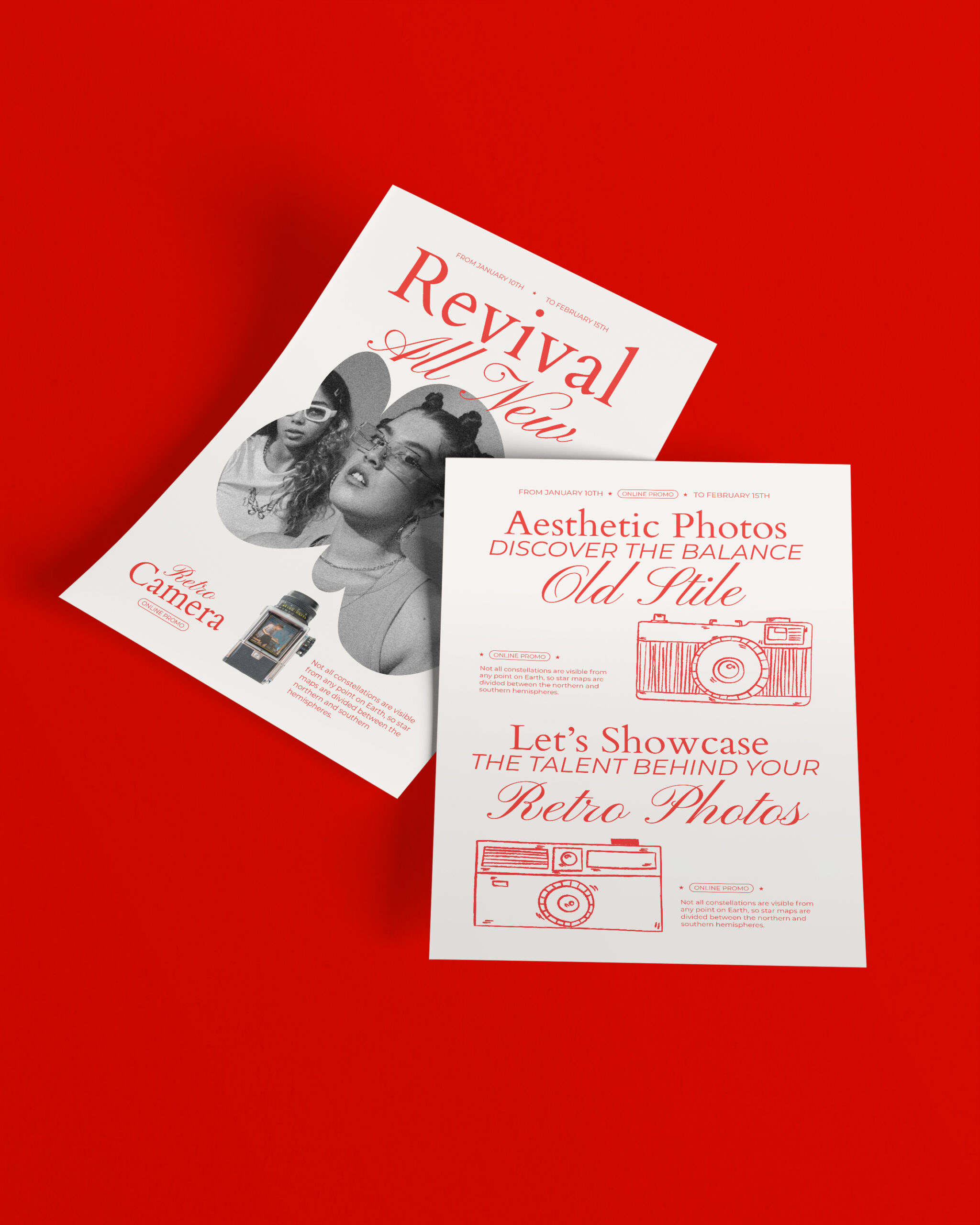
The campaign unfolds through a coordinated series of promotional materials, intended for both print and digital distribution. The consistency across editorial content, layout, and visual style results in a cohesive identity with a clean, refined look & feel, enriched by a touch of sophisticated irony. The outcome is a balanced and evocative visual experience with strong aesthetic impact.
The templates, designed to be easily customizable, are available in editable formats for Adobe Illustrator and Photoshop. You can download them on Freepik.com at the following link: https://www.freepik.com/serie/408591342
Objectives
The goal of the project is to celebrate contemporary photography through a visual language that echoes the style and charm of the past, perfectly aligned with the product’s identity.


Concept
The concept revolves around the theme of visual memory and retro charm, taking shape as a journey through the aesthetics of different eras. The aim is to embody, through design, the passage of time as experienced by a hypothetical brand rooted in the world of vintage photography.
The keywords guiding the project are: nostalgia, authenticity, visual craftsmanship.
Images and written content weave together into a layered visual language, blending references to analog photography, 1950s–70s editorial design, typographic minimalism, the fluid forms of 1980s–90s graffiti, and screen printing.
The project seeks a deliberate balance between visual romanticism and graphic precision, delivering an aesthetic experience that evokes the past while embracing a contemporary design sensibility.
Design
The visual system is built around a few key elements:
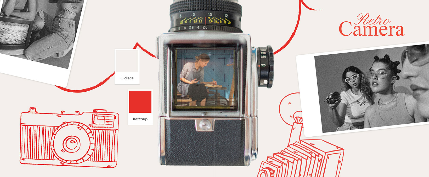
Color palette: The contrast between the natural white of the paper and a slightly desaturated red serves as the expressive core of the project. The red, used for both text and illustrations, evokes traditional letterpress printing and delivers an immediate visual impact while maintaining a sense of elegance.
Typography: The combination of a calligraphic serif typeface with a modern, readable sans-serif creates a dialogue between past and present. The serif, with its fluid curves, references vintage print design, while the sans-serif ensures clarity and legibility. All fonts used in the project are available on Google Fonts, making the templates fully accessible and easy to edit across platforms. The selected typefaces include Montserrat, Times New Roman, and Pinyon Screept each chosen for its ability to evoke a different layer of the project’s visual narrative.
Illustration: Vintage cameras are depicted using a monochromatic line-art style, making them decorative yet unobtrusive. They act as evocative icons that reinforce the curatorial theme of the exhibition.
Photography: The use of black-and-white photography featuring characters styled from the ’80s and ’90s—with soft cropping and fluid shapes—recalls the editorial aesthetics of mid-century magazines mixed with the underground edge of late 20th-century culture. The images feel as if lifted from family photo albums or vintage publications, enhancing the sense of authenticity.
Composition and hierarchy: The layout is centered, orderly, and spacious, with generous white space. Elements follow a strict grid system that guides the viewer’s eye effortlessly. The use of spontaneous, hand-drawn shapes as photo containers breaks the rigidity, adding visual rhythm and dynamism.