Interior Design Firm
Team
- Art Direction: Marina Embiz, Valentina Maccioni - Graphic Design: Valentina Maccioni - Photography: Freepik - Illustration: Freepik
Client
Project Overview
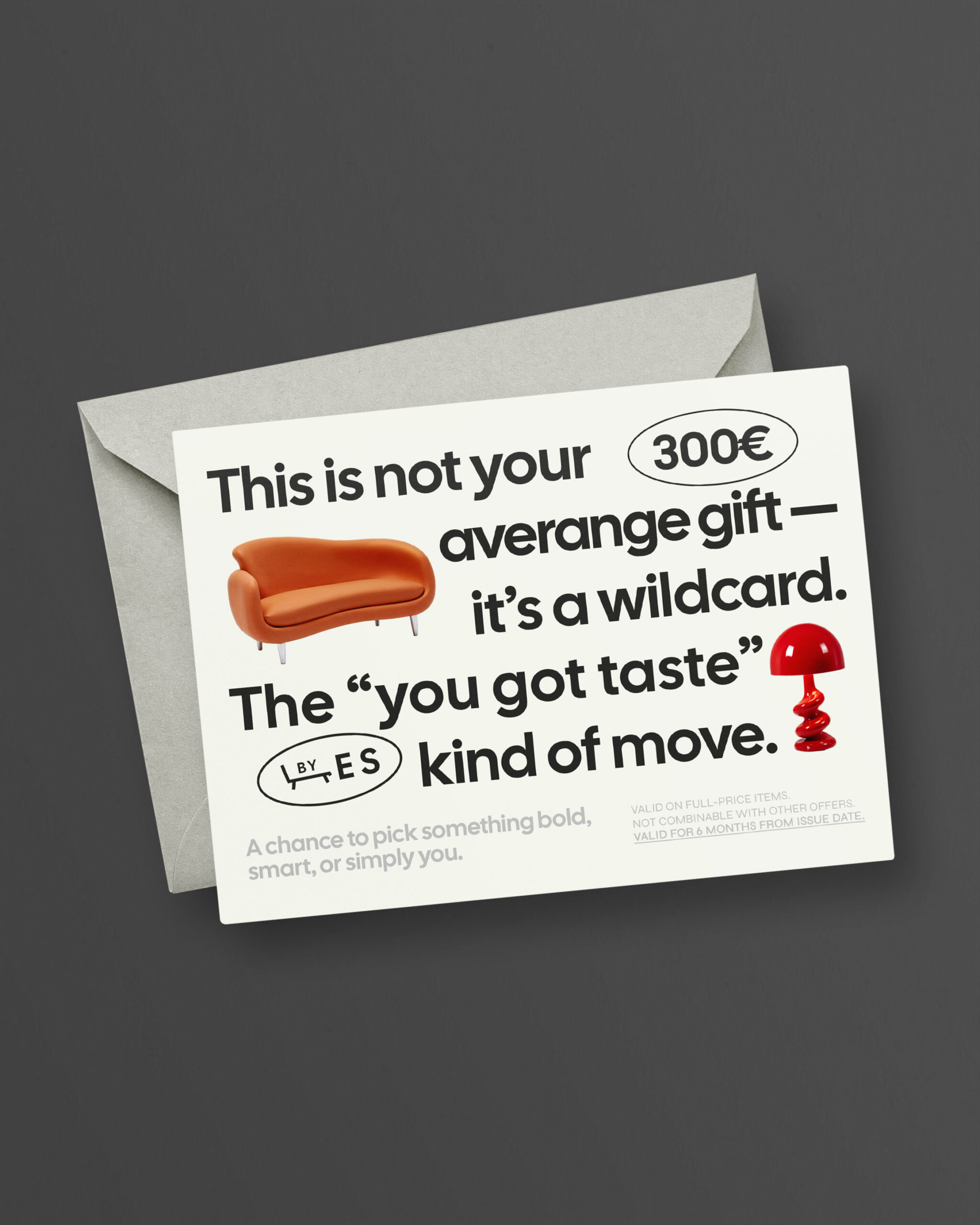
This project is a collection of templates created for Freepik, designed to simulate an interior design brand: Eclectic Studio. The fictional brand targets an audience with a strong appreciation for contemporary designer pieces, where furniture is treated as iconic and collectible. The visual communication adopts a bold, engaging, and highly graphic tone. The templates — including posters, business cards, and promotional materials — were designed to be versatile across various print applications, while consistently maintaining a cohesive, eye-catching, and functional visual identity.
The templates, designed to be easily customizable, are available in editable formats for Adobe Illustrator and Photoshop. You can download them on Freepik.com at the following link → https://www.freepik.com/serie/418231989
Objectives
The main goal was to create a set of templates for Freepik that would meet the needs of creative studios looking for a fresh and distinctive visual identity for clients in the interior design, furniture, or contemporary lifestyle sectors. The target audience of the Eclectic Studio brand consists of interior design enthusiasts with an urban lifestyle and a bold aesthetic taste — drawn to unique, designer-made objects, vibrant colors, and unconventional expressive solutions.


Concept
The project’s key words are: authorship, sophisticated pop eclecticism, and playfulness. The tone of voice is direct, ironic, and emotive: the brand’s products are integrated into the typography and appear to “speak,” engaging the viewer in a visual narrative that turns furniture into the protagonists of the communication. The look & feel is built on a balance between typographic minimalism and bold color palettes driven by the featured products.
Design
The Eclectic Studio logo was custom-designed specifically for this project. It takes the form of a typographic wordmark that embodies the brand’s bold and sophisticated identity. Set in Cal Sans bold, the logotype stands out for its essential geometry and solid presence, evoking both a sense of rigor and a creative industry aesthetic. Complementing the main mark, the word “by” reinforces the idea of authorship, while a geometric decorative element — inspired by the shape of a seat — visually represents the product and subtly suggests the concept of comfort. A compact version of the logo is also included: a pictogram featuring the initials ES, designed to resemble an industrial-style stamp.
The visual system is built around a few key elements:
Color Palette: The project is built on an essential palette: black and white serve as a neutral base, highlighting the saturated colors of the furniture pieces.
Typography: The primary typeface is Cal Sans, a bold geometric sans-serif used for all headings. The secondary typeface is Syne Regular, also a geometric sans-serif but with a more condensed appearance compared to the primary font. All fonts used in the project are available on Google Fonts, making the templates fully accessible and easy to edit across platforms.
Photography: The products are treated as central photographic elements, cut out on a neutral background to emphasize their materiality and form.
Composition: The composition is dynamic and playful, guiding the eye in a linear reading flow. The grid is modular yet flexible, designed to adapt to various resolutions. The visual hierarchy balances oversized text with generous white space to create rhythm and enhance readability.