Building a scalable visual language for TicketSms' ecosystem of event management products.
TicketSms needed a consistent way to communicate multiple new digital products across its ecosystem. The project focused on developing a brand ecosystem and a modular illustration system capable of supporting marketing, product communication, and corporate content while maintaining visual coherence across all touchpoints.
Brand Identity Extension
The brand identity extension was developed to address a specific challenge: enabling event organizers to quickly recognize and distinguish each digital product while managing events and navigating multiple tools on screen.
Following the creative direction, color was identified as the primary differentiating element within the extended identity system. Assigning a distinctive color to each product improved recognition and usability, while preserving visual consistency across the broader TicketSms brand ecosystem.
Core Components:
Logo
Each product logo was designed using the corporate pictogram paired with the official Noto Sans typeface at a lighter weight, creating a consistent relationship with the master brand while preserving the identity of each product.
Color System
A dedicated color was assigned to each product. The palette maintains the same saturation and brightness levels as the corporate color while extending into distinct hues, one for each product, making them immediately recognizable on screen.
App Icon
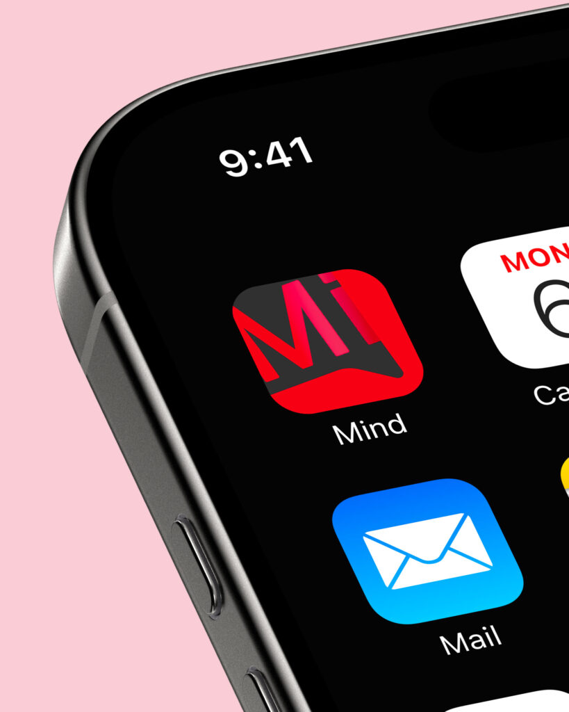
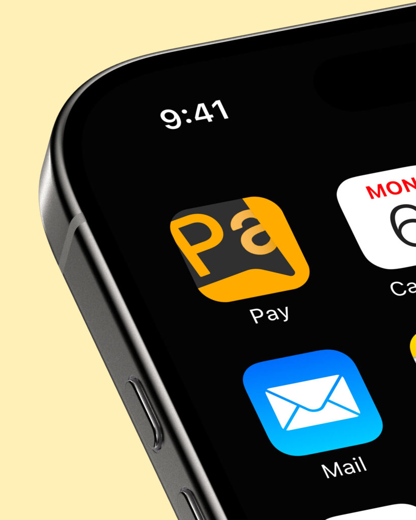
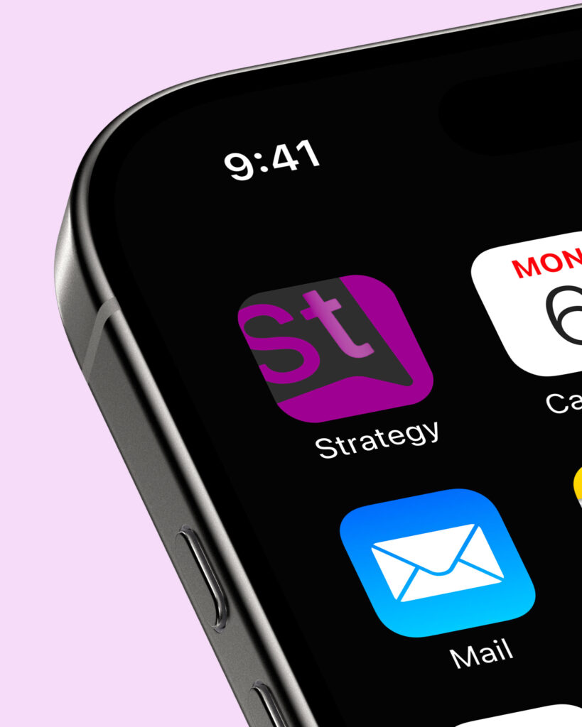
The app icons were created by combining the corporate pictogram with the official typographic system.
Outcome
Mind
Access
Pay
Strategy
Virtualplace
Illustration System
To maintain continuity with the existing visual identity while addressing a more professional B2B audience, we introduced communication elements inspired by the digital environment. At the same time, the original sketch-style graphics were simplified and evolved into an iconographic system, preserving the brand’s personality in a more structured and scalable form.
The illustration system was built around a modularset of visual components inspired by the digital environment.
Modularity: Assets can be recombined across products and communication channels.
Scalability: The visual language can expand as new products are introduced.
Consistency: Every illustration follows a shared set of visual rules.
Recognition: Color coding and iconography help users quickly identify products.
Core Components:
Color System
Each illustration set inherits the color assigned to its corresponding product, strengthening recognition across the ecosystem.
Interface Elements
UI-inspired components help contextualize product functionalities and digital experiences.
Decorative Sketches
Custom sketches derived from the brand identity act as recurring visual cues, reinforcing consistency across all applications.
Illustration Library
The system was applied across multiple products and communication touchpoints and adapted across TicketSms suite digital communication channels like homepage hero banner, product landing pages, website section headers, marketing campaign assets.
Mind
Access
Pay
Strategy
Virtualplace
Impact
The challenge was developing a scalable visual system capable of supporting multiple products while preserving a coherent brand experience.
By combining a dedicated color architecture, custom application icons, interface-inspired elements, and brand-specific decorative sketches, the system provided a flexible framework that could evolve alongside the TicketSuite ecosystem and future product launches.